After attempting to follow the Clipped Panel Scroll View tutorial at the NGUI website, I realized that it’s lacking some information that probably isn’t obvious for beginners like myself. It omits some crucial details, and adds extraneous UI elements that add unnecessary complexity to the example.
This rough but thorough tutorial is my attempt to fill in the gaps with an example that only includes the necessary UI elements. Please leave a comment if you feel I need to elaborate in any areas. I’m still learning NGUI so my solution may not be ideal, but it should be clearer than the official tutorial.
For what it’s worth, I’m using Unity 4.1.5f1 for Windows, NGUI 2.6.4 (August 3, 2013). I noticed that the tutorials quickly get out of date as the NGUI interface extensions change.
To summarize what we’re going to accomplish, we’re going to create a tiled grid of images that we can drag left and right, which will clip when outside the bounds of the panel they’re contained within. Spoiler alert:

1. Create a new Unity project and import the NGUI package.

2. Delete the Main Camera that appears by default. When we create the NGUI UI, it’ll create the camera we’ll use.

3. Select NGUI->Open the UI Wizard, and you’ll see the following dialog. Accept the defaults and click Create Your UI.

4. You should now see some objects in your Hierarchy created, which are pretty standard for NGUI UIs.

This Panel will be the panel whose bounds will clip content that we add inside it. If you select it, you’ll see that its bounds highlight in green, and match the camera’s bounds currently.

Side note: You’ll notice that the white camera gizmo icon is ridiculously huge. You can scale this down by clicking the Gizmos dropdown in the Scene view and dragging the 3D Gizmos slider to the left as desired.

5. While we have the Panel selected, change its Clipping value to Hard Clip from the Inspector. This will ensure that anything outside the bounds of the Panel will be clipped.
Notice that this revealed some additional properties, Center and Size. Change the Size property to something like X,Y (400, 100). This will create a restrictive clipping range that will allow us to demo the clipping a little bit more easily.
6. Add a Draggable Panel component to the default Panel. With this Panel selected, choose Component->NGUI->Interaction->Draggable Panel. We’ll manipulate its properties a little bit later.
7. Now we want to add a Grid as a child to our Panel. A Grid element, as I understand it, just organizes its children in such a way that they’re spaced evenly. Select GameObject->Create Empty to create a new, empty GameObject in the scene. Drag this GameObject to the Panel to attach it as a child.

Rename this object “Grid” for clarity, and with it selected, choose Component->NGUI->Interaction->Grid to add the Grid component to this object. We’ll discuss the UIGrid component’s properties a bit later.
8. Next we’re going to add children to the grid, which will be the images that we’ll scroll left and right in and out of the clipping region. Specifically, we’re going to add one item as a child, configure it properly, and then duplicate it several times to create each grid item from a template that’s configured exactly as we want it.
First, let’s create a Sprite object as a child of the Grid. Select the Grid object and then choose NGUI->Create a Sprite. With this Sprite object selected, you’ll notice that the UISprite component is pretty bare if you look at it in the Inspector.

This is because we haven’t even created a sprite image yet, and the sprite atlas that will contain this image. Let’s do that now.
9. Using your favorite image editing program, create an image to be the “tile” that will be repeated in a horizontal pattern, and scrollable left and right, clipped at the bounds of our panel. This is just a sample, so create or steal whatever image you want, but let’s make its dimensions 64x64. Here is mine:

Add this image to your project’s Assets folder.
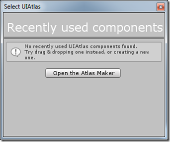
10. With the Sprite selected in the Hierarchy, click the Atlas button. Since there’s no atlas in the project, you’ll see this dialog:

Click the Open the Atlas Maker button to open the Atlas Maker. This isn’t a tutorial on how to create a texture atlas so I’ll just walk through the steps.
With the Atlas Maker open, select your newly added Texture from the Project window. It will appear in the list of Sprites (mine is called “tile_image”).

Click the Create button and all of the assets required for the atlas will be created (Material, GameObject, and the generated image).

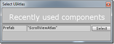
11. Now select your Sprite from the Hierarchy again, and this time you’ll be able to select an atlas when you click the Atlas dropdown.

Select your Atlas and your sprite from the Inspector. If you experience what I did, you’ll notice that your sprite doesn’t appear properly. This was because, for some bizarre reason, my Grid object had a scale of XYZ (263, 263, 263). Why? I have no idea. But in any case, you’ll want to change that to (1, 1, 1). At that point, your beautiful sprite image will come into view:

If your image is positioned oddly within the Panel, select the Grid in the hierarchy and move it to a sensible location.
12. Before we start duplicating this sprite (hold your horses), we need to configure some things on the sprite’s GameObject and the Grid. First, click the Make Pixel-Perfect button which should force the scale of the sprite’s object to match the pixel dimensions of the sprite image.
Now, select the Grid and change the Cell Width and Cell Height properties to 64. This essentially says: “Space each item by 64 units, horizontally and vertically”. This matches the size of the image, so they’ll stay snugly together. In our case, only Cell Width matters, but I like consistency.

13. Select the Sprite again in the Hierarchy, and choose Component->NGUI->Interaction->Drag Panel Contents. This is how the UIDraggablePanel component which we added to the Panel knows what to drag.
14. You still can’t drag your image around (you can test this by running in the editor and clicking/dragging your sprite—note that if it’s your first time, you’ll have to make sure you’ve saved your scene). In order to do this, we need to add collision bounds to sprite. Thankfully, this is easy. Choose NGUI->Attach a Collider. This should create a collider around your sprite which conveniently matches its dimensions:

If you run the game in the editor now, you can click and drag your image around, both horizontally and vertically. Neat!
15. Since we only want horizontal scrolling for our example, we need to specify this restriction. The way we do this is by selecting the Panel in the Hierarchy, expanding the Scale property of the UIDraggablePanel component, and setting the scale to XYZ (1, 0, 0). This prevents dragging in the Y and Z directions. Also uncheck “Restrict Within Panel”, because we don’t need that restriction (it would spring the panel contents into the panel if they’re dragged outside).
16. We’re finally ready to duplicate the sprite. Do this simply by selecting the sprite and typing Ctrl+D (or if you’re a n00b like me, right-click the Sprite and select Duplicate from the context menu). Do this 4-5 times.
Note that you will still see just one image. That’s because the new images aren’t yet positioned properly. Positioning within a grid in the editor is not automatic. Select the Grid object and click Reposition now. You should see something like this:

17. Run this in the editor, click your tiled images, and drag left and right. Voila! You can drag the tiles back and forth, and they should properly clip when outside the bounds of the Panel.
This is great - very clear and perfect. Thank you
ReplyDeleteThank you soo much for putting time for this nice tutorial, You saved my day :)
ReplyDeleteJust wanted to mirror the sentiments above. Cheers!
ReplyDeleteI have the latest NGUI version, and there isn't a "draggable panel" component. Is "Drag Scroll View" the alternative?
ReplyDeleteIf not, how can I still do this?
I just checked out the Tasharen Entertainment version updates for NGUI. The Draggable panel is now replaced with UIScrollView which now uses whole numbers, keeping itself pixel-perfect (thus the option removed).and UIDragPanelContents is now UIDragScrollView.
DeleteIn UIGrid component, the "reposition now" option is also removed, you have to right click on the grid componnent >script>exicute.
I thought this should be helpful for other users... ^_^
Wow !! simple and great tutorial really helpfull :)
ReplyDelete